'%3e%3cmask%20id='mask0_15927_6579'%20style='mask-type:luminance'%20maskUnits='userSpaceOnUse'%20x='0'%20y='0'%20width='20'%20height='20'%3e%3cpath%20d='M0%200H20V20H0V0Z'%20fill='white'/%3e%3c/mask%3e%3cg%20mask='url(%23mask0_15927_6579)'%3e%3cpath%20fill-rule='evenodd'%20clip-rule='evenodd'%20d='M10%200C4.475%200%200%204.475%200%2010C0%2014.425%202.8625%2018.1625%206.8375%2019.4875C7.3375%2019.575%207.525%2019.275%207.525%2019.0125C7.525%2018.775%207.5125%2017.9875%207.5125%2017.15C5%2017.6125%204.35%2016.5375%204.15%2015.975C4.0375%2015.6875%203.55%2014.8%203.125%2014.5625C2.775%2014.375%202.275%2013.9125%203.1125%2013.9C3.9%2013.8875%204.4625%2014.625%204.65%2014.925C5.55%2016.4375%206.9875%2016.0125%207.5625%2015.75C7.65%2015.1%207.9125%2014.6625%208.2%2014.4125C5.975%2014.1625%203.65%2013.3%203.65%209.475C3.65%208.3875%204.0375%207.4875%204.675%206.7875C4.575%206.5375%204.225%205.5125%204.775%204.1375C4.775%204.1375%205.6125%203.875%207.525%205.1625C8.325%204.9375%209.175%204.825%2010.025%204.825C10.875%204.825%2011.725%204.9375%2012.525%205.1625C14.4375%203.8625%2015.275%204.1375%2015.275%204.1375C15.825%205.5125%2015.475%206.5375%2015.375%206.7875C16.0125%207.4875%2016.4%208.375%2016.4%209.475C16.4%2013.3125%2014.0625%2014.1625%2011.8375%2014.4125C12.2%2014.725%2012.5125%2015.325%2012.5125%2016.2625C12.5125%2017.6%2012.5%2018.675%2012.5%2019.0125C12.5%2019.275%2012.6875%2019.5875%2013.1875%2019.4875C15.1726%2018.8173%2016.8976%2017.5414%2018.1197%2015.8395C19.3418%2014.1375%2019.9994%2012.0952%2020%2010C20%204.475%2015.525%200%2010%200Z'%20fill='white'/%3e%3c/g%3e%3c/g%3e%3cdefs%3e%3cclipPath%20id='clip0_15927_6579'%3e%3crect%20width='20'%20height='20'%20fill='white'/%3e%3c/clipPath%3e%3c/defs%3e%3c/svg%3e) GitHub
GitHub'%3e%3cpath%20id='Vector'%20fill-rule='evenodd'%20clip-rule='evenodd'%20d='M0.833333%202.365C0.833774%201.95891%200.995288%201.56958%201.28244%201.28244C1.56958%200.995288%201.95891%200.833774%202.365%200.833333H17.6333C17.8346%200.833005%2018.034%200.872386%2018.2201%200.949222C18.4062%201.02606%2018.5753%201.13884%2018.7177%201.28111C18.8601%201.42339%2018.9731%201.59235%2019.0501%201.77834C19.1272%201.96433%2019.1668%202.16369%2019.1667%202.365V17.6333C19.1667%2018.0399%2019.0052%2018.4297%2018.7179%2018.7173C18.4305%2019.0048%2018.0407%2019.1664%2017.6342%2019.1667H2.365C1.95877%2019.1662%201.56931%2019.0046%201.28214%2018.7173C0.99497%2018.4299%200.833554%2018.0404%200.833333%2017.6342V2.365ZM8.09%207.82333H10.5725V9.07C10.9308%208.35333%2011.8475%207.70833%2013.225%207.70833C15.8658%207.70833%2016.4917%209.13583%2016.4917%2011.755V16.6067H13.8192V12.3517C13.8192%2010.86%2013.4608%2010.0183%2012.5508%2010.0183C11.2883%2010.0183%2010.7633%2010.9258%2010.7633%2012.3517V16.6067H8.09V7.82333ZM3.50667%2016.4925H6.18V7.70833H3.50667V16.4925ZM6.5625%204.84333C6.56754%205.07223%206.52681%205.29982%206.4427%205.51276C6.35859%205.7257%206.23279%205.9197%206.07269%206.08336C5.91259%206.24702%205.72142%206.37706%205.51038%206.46584C5.29934%206.55462%205.0727%206.60035%204.84375%206.60035C4.6148%206.60035%204.38816%206.55462%204.17712%206.46584C3.96608%206.37706%203.77491%206.24702%203.61481%206.08336C3.45471%205.9197%203.32891%205.7257%203.2448%205.51276C3.16069%205.29982%203.11996%205.07223%203.125%204.84333C3.13489%204.39405%203.32032%203.96649%203.64157%203.65224C3.96282%203.33798%204.39435%203.16201%204.84375%203.16201C5.29315%203.16201%205.72468%203.33798%206.04593%203.65224C6.36718%203.96649%206.55261%204.39405%206.5625%204.84333Z'%20fill='white'/%3e%3c/g%3e%3cdefs%3e%3cclipPath%20id='clip0_0_641'%3e%3crect%20width='20'%20height='20'%20fill='white'/%3e%3c/clipPath%3e%3c/defs%3e%3c/svg%3e) LinkedIn
LinkedInChallenge
The challenge was to serve both people who wanted to explore options and people who arrived with a specific goal, without losing clarity anywhere along the way.
Paula RodasSenior Product Designer & Product Builder· open to new projects
Work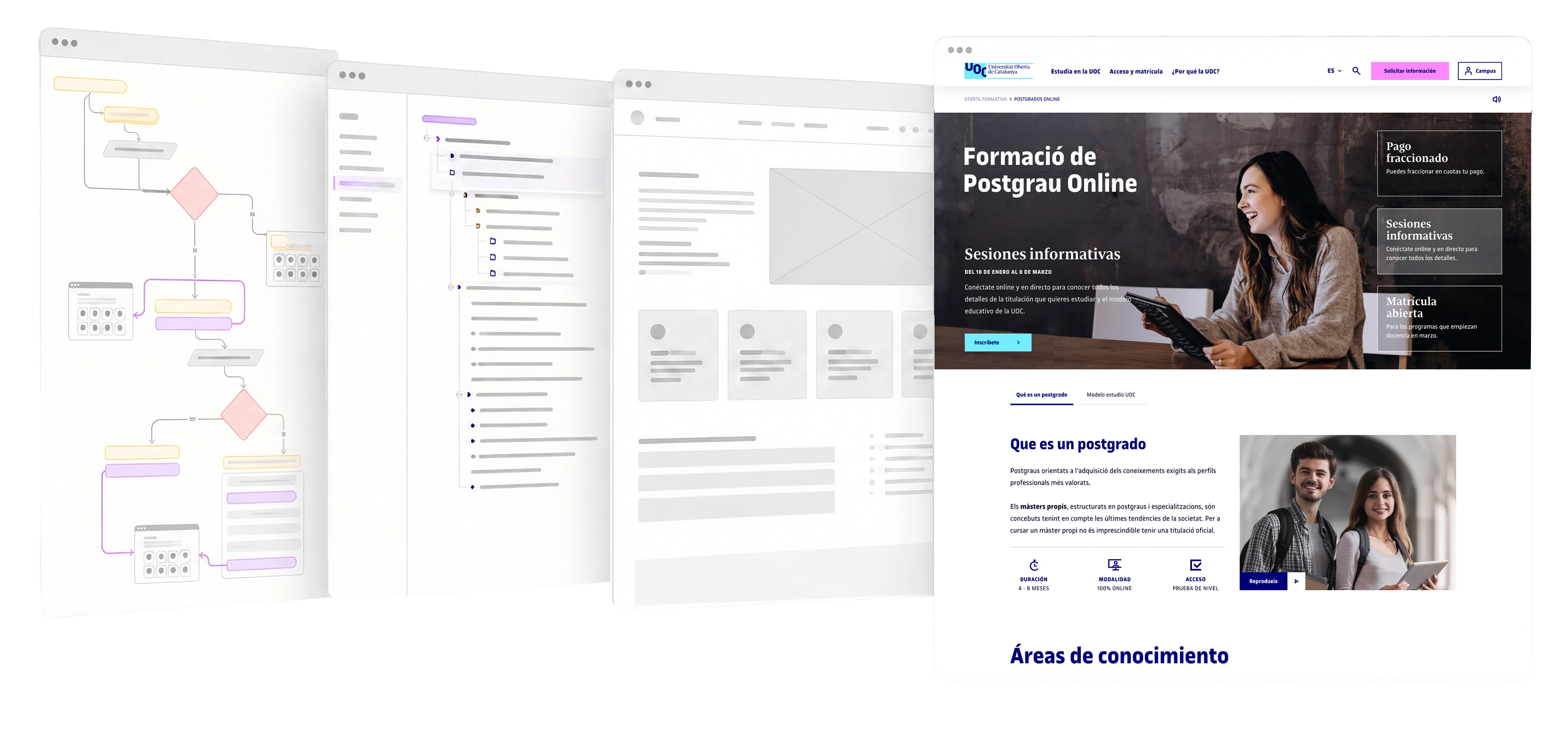
How do you help people choose among hundreds of academic options without getting lost in the catalog? How information architecture, navigation, and content prioritization turned exploring into a decision experience.
9 min read
The challenge was to serve both people who wanted to explore options and people who arrived with a specific goal, without losing clarity anywhere along the way.
During the navigation audit, I found that the same goal (finding a program) could follow up to five different logics depending on the type of program.
My work focused on applied synthesis, information architecture, navigation, prioritization, listing pages, search, wireframes, and UX review.
The result was a structural transformation taken to production, built together by research, UX, UI, the client, and development.
OVERVIEW
The Universitat Oberta de Catalunya (UOC) is an online university with a large and varied range of programs. During my time at Fail Fast, I worked as a UX Designer on the redesign of its study offering, rethinking how programs were organized, explored, and evaluated on the website: from the first contact with the catalog to requesting information or enrolling.
THE CHALLENGE
Redesigning the study offering meant bringing coherence to a large ecosystem of degrees, content, and entry points. The challenge was to serve both people who wanted to explore options and people who arrived with a specific goal, without losing clarity anywhere along the way.
The goal was to build a coherent experience from the first contact with the catalog to requesting information or enrolling.
Understand the offering → find options → evaluate a program → compare options → act
RESEARCH SYNTHESIS
The research team had already worked with current students, prospective students, and stakeholders. I received the findings through presentations, documents, Miro boards, and spreadsheets, and turned them into product decisions.
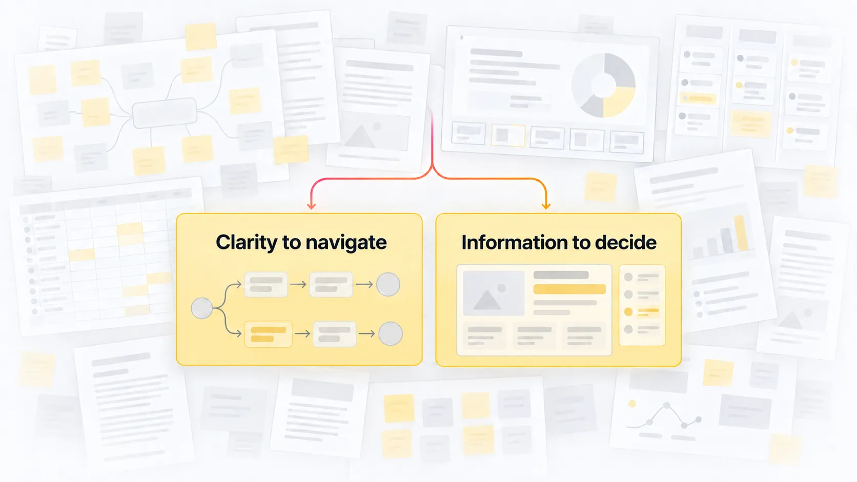
The results showed two complementary needs:
I turned these findings into content priorities and experience principles.
Findings → priorities → navigation rules → page structure → wireframes
NAVIGATION
The menu audit revealed two connected problems: many options visible at the same time, and up to five different logics for reaching a program depending on its type.
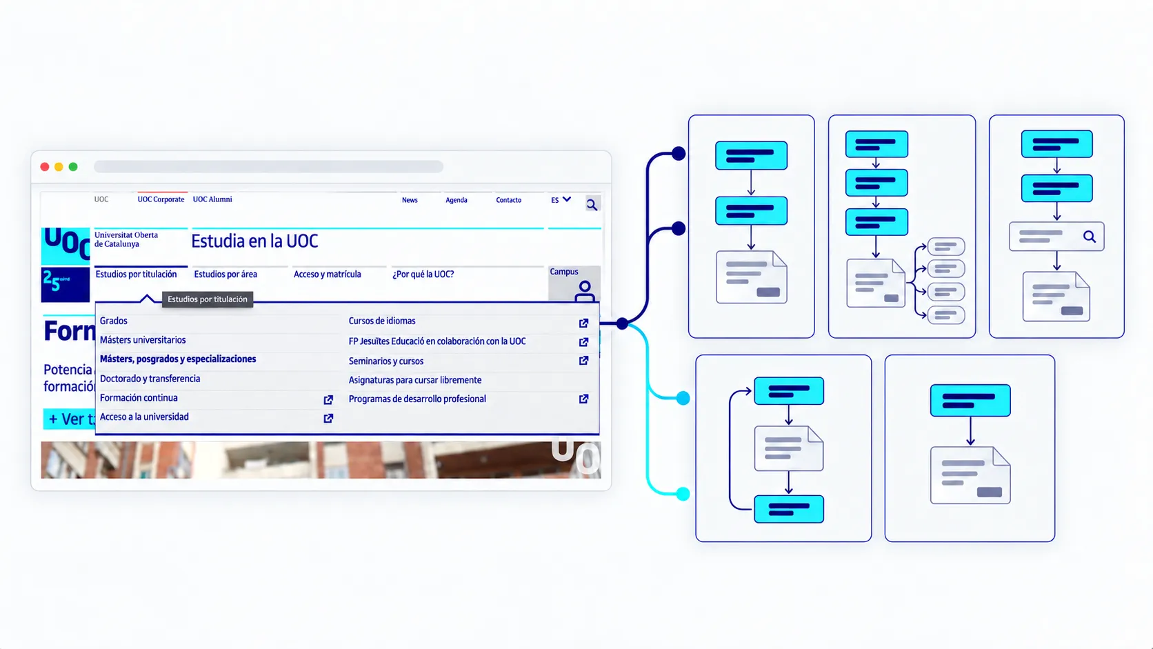
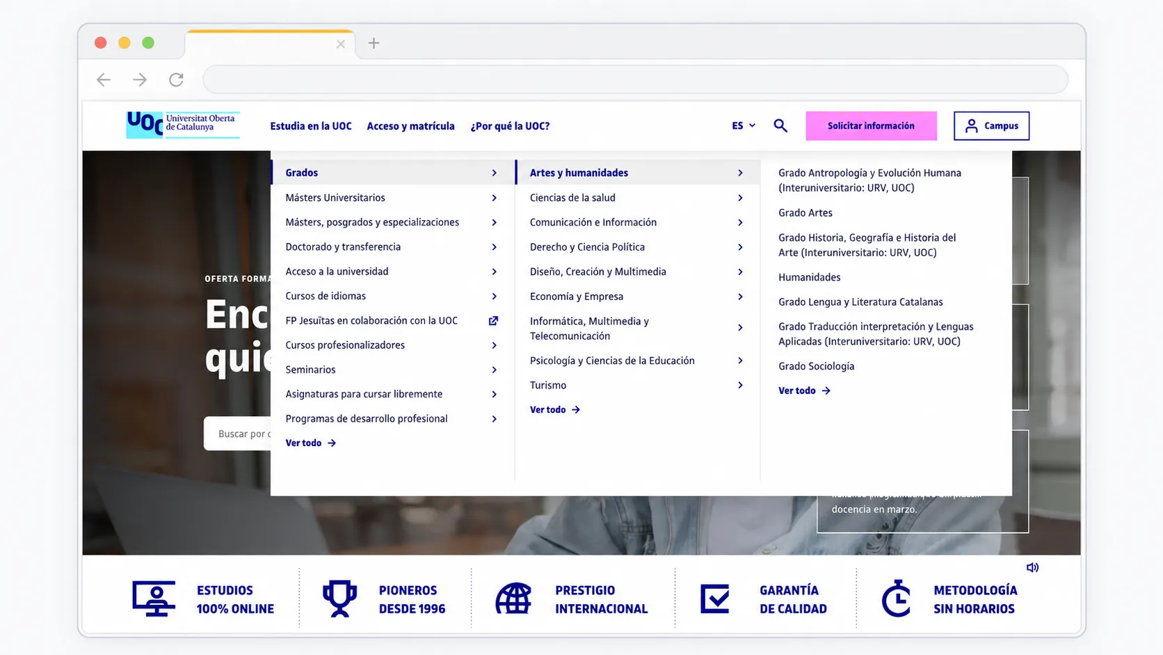
Based on the audit and the insights, I proposed a mega menu with up to three levels to organize exploration without hiding the variety of the offering. The structure had to work both for people who wanted to discover options by type of program or area of study and for people looking for a specific degree.
Instead of forcing the same depth on every path, I defined a common rule with explicit variations: a first level for program types, a second level for areas when they added context, and a third level to reach programs or relevant listings. Direct paths stayed in place when an extra layer added no value.
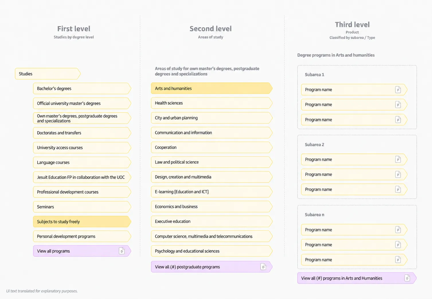
The two- and three-level menu cases let us check that the system handled the catalog’s real variations while staying predictable.
DISCOVERY FLOW
Coherent navigation was only the first step. The experience also had to help people narrow a large catalog down to manageable options, without making them filter before they understood what they were exploring.
User insights showed that it was easy to lose focus on very long listing pages. To address this, exploration combined two layers:
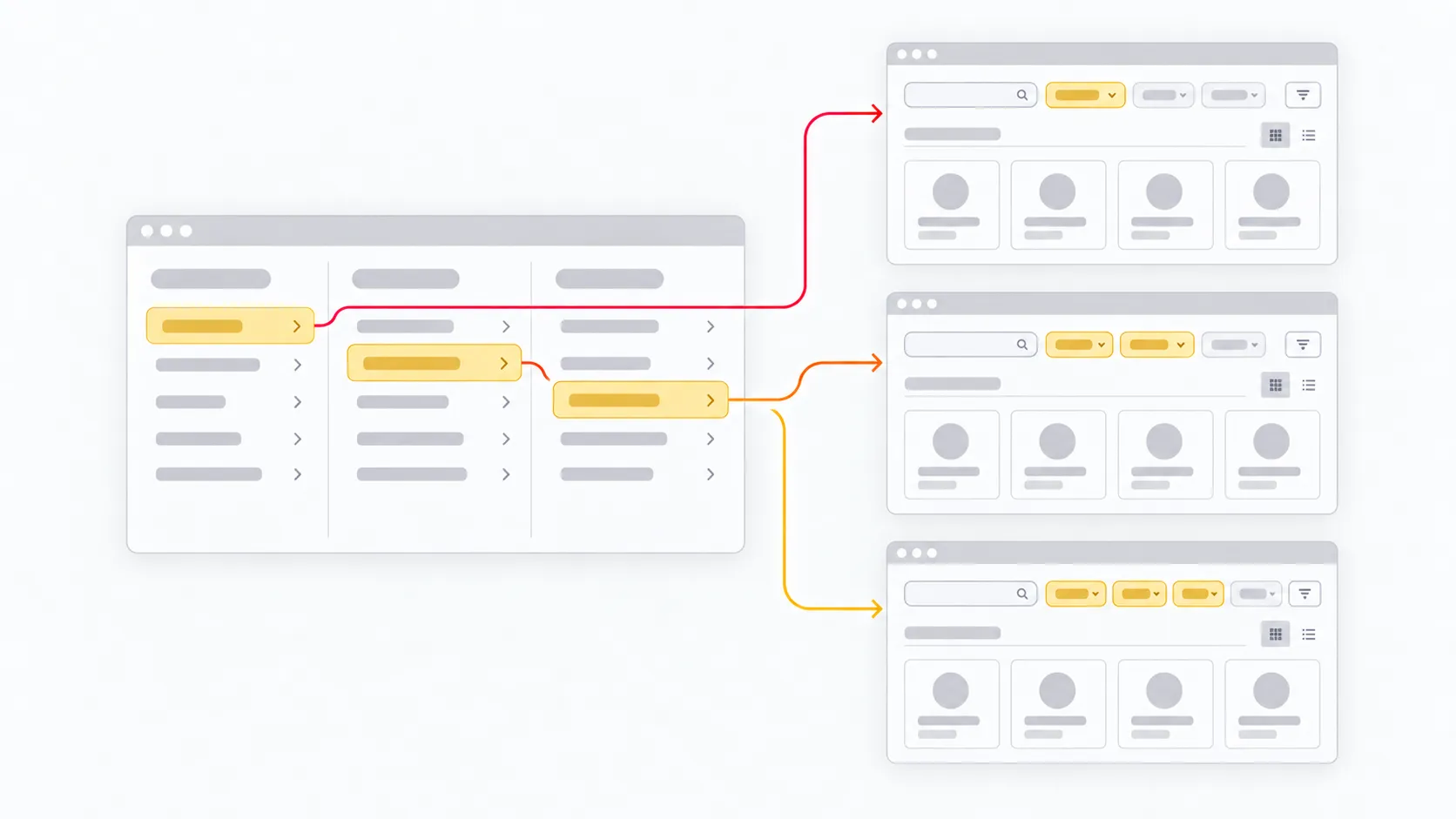
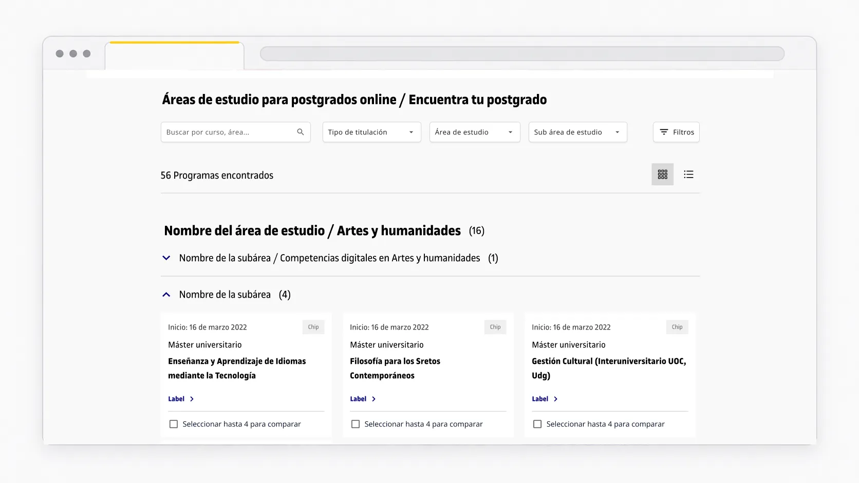
The landing page for each area also answered a priority question: giving relevant information about the UOC’s study model from the first read. Requesting information was built in as support during exploration.
With this structure, people could explore by program type or area of study, start from a relevant set of results, search by course, area, or degree while combining filters, and move from a listing to a program page along a clear path.
DECISION SUPPORT
When several options could fit, the comparison tool let people gather relevant programs and compare them before requesting information or enrolling. It was built into the listing experience, at the moment when people were still exploring and needed to decide between programs, so they didn’t have to open several program pages and remember the differences.
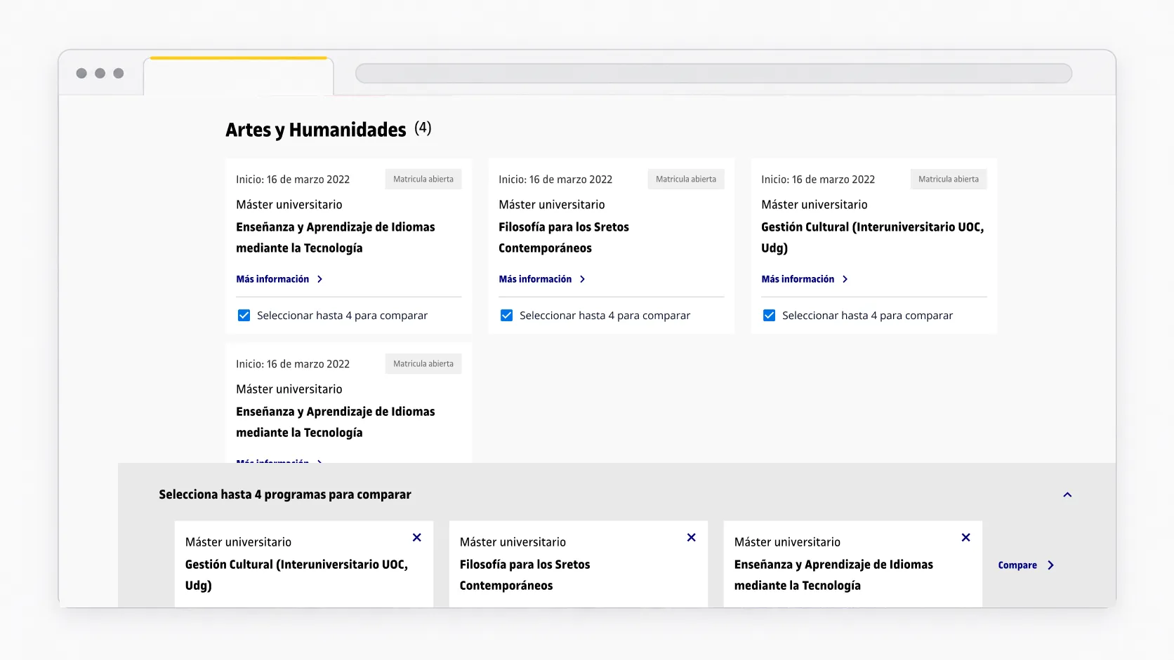
The goal was to make exploring programs easier with a faster overview and simpler search, both for people who wanted to discover options and for those who arrived with a specific need.
UX WIREFRAMES
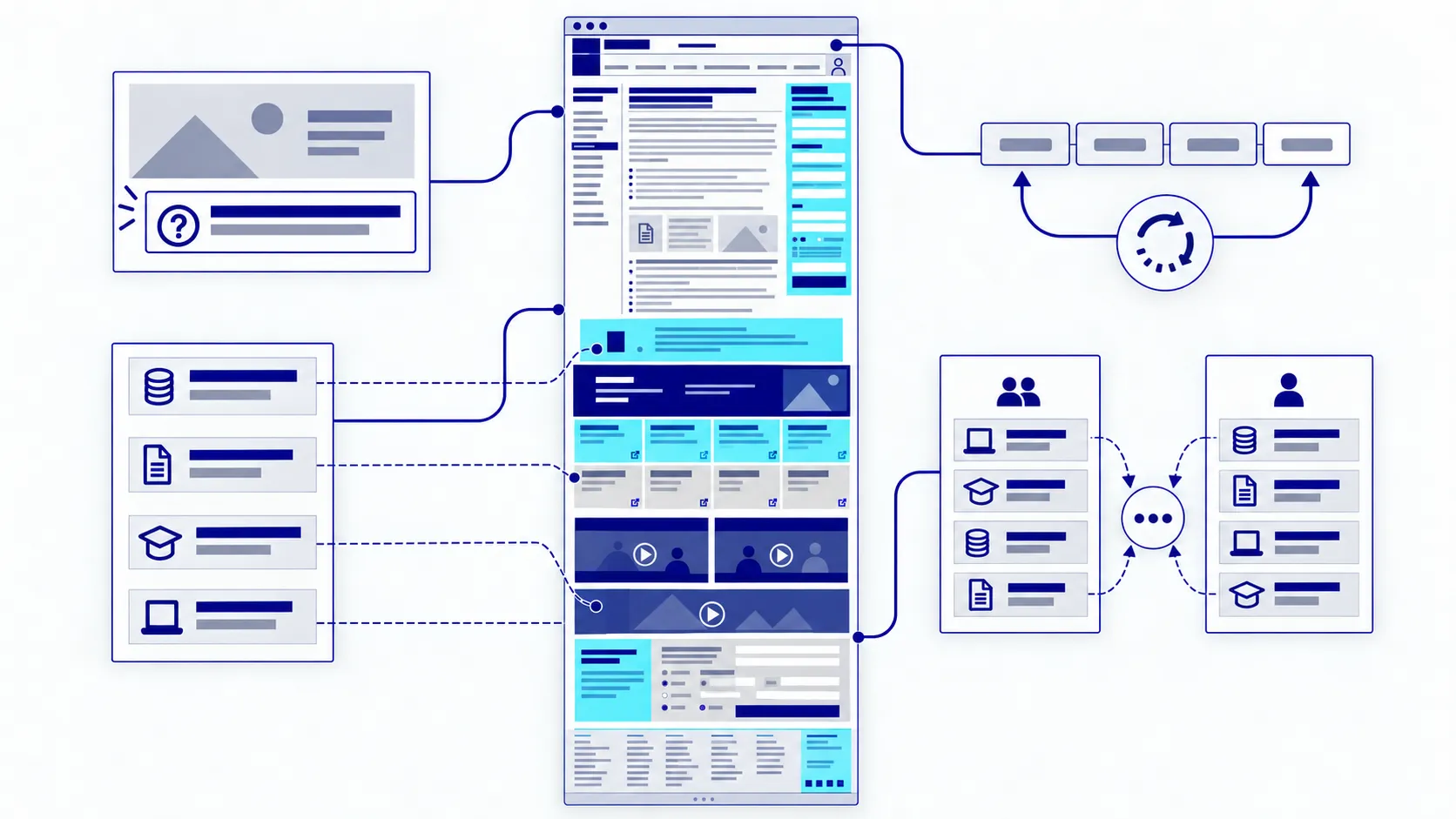
The program page held a large amount of academic information and was one of the key moments in the journey. The challenge was to make it clearer, easier to scan, and easier to navigate. It also had to reflect the content priorities identified for students and stakeholders.
Main problems found:
Design decisions:
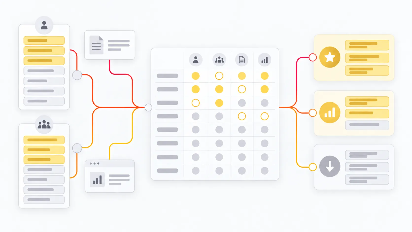
Build a hierarchy from a prioritization matrix. I crossed the student and stakeholder rankings with the research findings and the patterns reviewed in the benchmark to order the content.
Make the study model explicit from the introduction. The degree introduction had to establish the online, asynchronous nature of the experience from the start.
Group the information into three layers: a summary for deciding (title, description, price, credits, dates, format, available places, and information or enrollment actions), local navigation by topic (introduction, curriculum, enrollment, career opportunities, quality, and experiences), and progressive content (academic, financial, and experience details, following the questions that come up during evaluation).
Replace page changes with anchor navigation. The top menu stayed with the page and let people jump between sections without reloading it, keeping context and cutting waiting time.

The architecture grouped academic, financial, admission, and experience information into progressive blocks, so each person could go deeper based on their own questions.
Deciding information first → immediate navigation to go deeper → visible actions to move forward
UX REVIEW
Once the architecture, navigation patterns, listing pages, search, program page, and comparison tool were validated, the UI team applied the visual language. My work continued with UX reviews to make sure the decisions on hierarchy, content, and navigation held up in the final interface.
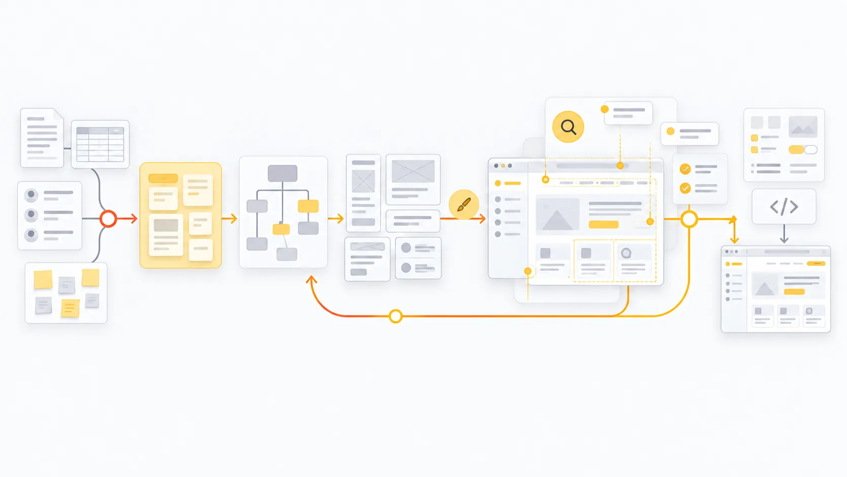
Existing research → UX synthesis → architecture → patterns and wireframes → UI → UX review → implementation
Attribution note: The initial research was done by the research team, and the visual design by the UI team. My work focused on applied synthesis, information architecture, navigation, prioritization, listing pages, search, wireframes, and UX review.
RESULT
As of this review, the redesigned study offering is still live, and the patterns we defined are still present on the UOC’s public website.
The result was a structural transformation taken to production, built together by research, UX, UI, the client, and development.
See the current study offering (opens in a new tab) · See programs by area (opens in a new tab)
LEARNINGS
Coherence came from defining clear rules for when a path needed one, two, or three levels, and when it could lead straight to a program.
Organizing the menu isn't enough if the listing pages, filters, and program pages don't help people move toward a decision.
When the offering is large, a tool to compare options reduces memory load and keeps the journey going.
Research gave a clear reading of users' needs; benchmarking leading examples helped recognize established patterns, spot opportunities, and propose better-grounded solutions.
User and stakeholder rankings didn't match on every point. Organizing the information to answer both made the proposal useful for people deciding what to study and workable for the organization.
Next case study
HSJD · Hospital Sant Joan de Déu