'%3e%3cmask%20id='mask0_15927_6579'%20style='mask-type:luminance'%20maskUnits='userSpaceOnUse'%20x='0'%20y='0'%20width='20'%20height='20'%3e%3cpath%20d='M0%200H20V20H0V0Z'%20fill='white'/%3e%3c/mask%3e%3cg%20mask='url(%23mask0_15927_6579)'%3e%3cpath%20fill-rule='evenodd'%20clip-rule='evenodd'%20d='M10%200C4.475%200%200%204.475%200%2010C0%2014.425%202.8625%2018.1625%206.8375%2019.4875C7.3375%2019.575%207.525%2019.275%207.525%2019.0125C7.525%2018.775%207.5125%2017.9875%207.5125%2017.15C5%2017.6125%204.35%2016.5375%204.15%2015.975C4.0375%2015.6875%203.55%2014.8%203.125%2014.5625C2.775%2014.375%202.275%2013.9125%203.1125%2013.9C3.9%2013.8875%204.4625%2014.625%204.65%2014.925C5.55%2016.4375%206.9875%2016.0125%207.5625%2015.75C7.65%2015.1%207.9125%2014.6625%208.2%2014.4125C5.975%2014.1625%203.65%2013.3%203.65%209.475C3.65%208.3875%204.0375%207.4875%204.675%206.7875C4.575%206.5375%204.225%205.5125%204.775%204.1375C4.775%204.1375%205.6125%203.875%207.525%205.1625C8.325%204.9375%209.175%204.825%2010.025%204.825C10.875%204.825%2011.725%204.9375%2012.525%205.1625C14.4375%203.8625%2015.275%204.1375%2015.275%204.1375C15.825%205.5125%2015.475%206.5375%2015.375%206.7875C16.0125%207.4875%2016.4%208.375%2016.4%209.475C16.4%2013.3125%2014.0625%2014.1625%2011.8375%2014.4125C12.2%2014.725%2012.5125%2015.325%2012.5125%2016.2625C12.5125%2017.6%2012.5%2018.675%2012.5%2019.0125C12.5%2019.275%2012.6875%2019.5875%2013.1875%2019.4875C15.1726%2018.8173%2016.8976%2017.5414%2018.1197%2015.8395C19.3418%2014.1375%2019.9994%2012.0952%2020%2010C20%204.475%2015.525%200%2010%200Z'%20fill='white'/%3e%3c/g%3e%3c/g%3e%3cdefs%3e%3cclipPath%20id='clip0_15927_6579'%3e%3crect%20width='20'%20height='20'%20fill='white'/%3e%3c/clipPath%3e%3c/defs%3e%3c/svg%3e) GitHub
GitHub'%3e%3cpath%20id='Vector'%20fill-rule='evenodd'%20clip-rule='evenodd'%20d='M0.833333%202.365C0.833774%201.95891%200.995288%201.56958%201.28244%201.28244C1.56958%200.995288%201.95891%200.833774%202.365%200.833333H17.6333C17.8346%200.833005%2018.034%200.872386%2018.2201%200.949222C18.4062%201.02606%2018.5753%201.13884%2018.7177%201.28111C18.8601%201.42339%2018.9731%201.59235%2019.0501%201.77834C19.1272%201.96433%2019.1668%202.16369%2019.1667%202.365V17.6333C19.1667%2018.0399%2019.0052%2018.4297%2018.7179%2018.7173C18.4305%2019.0048%2018.0407%2019.1664%2017.6342%2019.1667H2.365C1.95877%2019.1662%201.56931%2019.0046%201.28214%2018.7173C0.99497%2018.4299%200.833554%2018.0404%200.833333%2017.6342V2.365ZM8.09%207.82333H10.5725V9.07C10.9308%208.35333%2011.8475%207.70833%2013.225%207.70833C15.8658%207.70833%2016.4917%209.13583%2016.4917%2011.755V16.6067H13.8192V12.3517C13.8192%2010.86%2013.4608%2010.0183%2012.5508%2010.0183C11.2883%2010.0183%2010.7633%2010.9258%2010.7633%2012.3517V16.6067H8.09V7.82333ZM3.50667%2016.4925H6.18V7.70833H3.50667V16.4925ZM6.5625%204.84333C6.56754%205.07223%206.52681%205.29982%206.4427%205.51276C6.35859%205.7257%206.23279%205.9197%206.07269%206.08336C5.91259%206.24702%205.72142%206.37706%205.51038%206.46584C5.29934%206.55462%205.0727%206.60035%204.84375%206.60035C4.6148%206.60035%204.38816%206.55462%204.17712%206.46584C3.96608%206.37706%203.77491%206.24702%203.61481%206.08336C3.45471%205.9197%203.32891%205.7257%203.2448%205.51276C3.16069%205.29982%203.11996%205.07223%203.125%204.84333C3.13489%204.39405%203.32032%203.96649%203.64157%203.65224C3.96282%203.33798%204.39435%203.16201%204.84375%203.16201C5.29315%203.16201%205.72468%203.33798%206.04593%203.65224C6.36718%203.96649%206.55261%204.39405%206.5625%204.84333Z'%20fill='white'/%3e%3c/g%3e%3cdefs%3e%3cclipPath%20id='clip0_0_641'%3e%3crect%20width='20'%20height='20'%20fill='white'/%3e%3c/clipPath%3e%3c/defs%3e%3c/svg%3e) LinkedIn
LinkedInChallenge
The design goal was to define a structure that let people find their way, locate relevant information, and explore it at different levels of detail.
Paula RodasSenior Product Designer & Product Builder· open to new projects
Work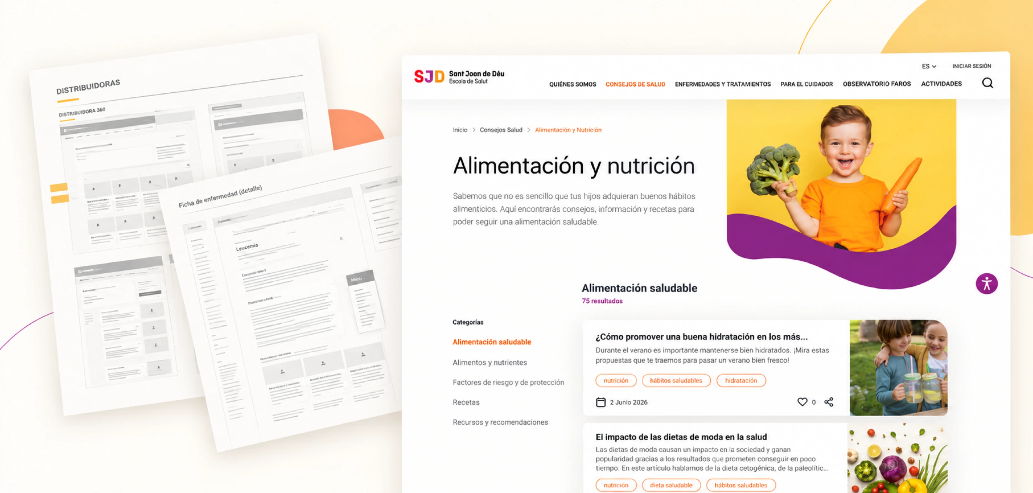
How do you help families find and understand health information based on their needs? This case explains how architecture, navigation, and content structures shaped a proposal for exploring health advice, looking up conditions, and finding support resources.
8 min read
The design goal was to define a structure that let people find their way, locate relevant information, and explore it at different levels of detail.
My work focused on information architecture, wireframes, and phased prioritization.
Exploring content and looking up specific information had to work side by side.
The delivery brought together a connected architecture, page patterns for desktop and mobile, and a phased implementation sequence.

OVERVIEW
In 2022, at Fail Fast, I worked on defining the Escola de Salut, an educational platform from Hospital Sant Joan de Déu Barcelona. My work started from the needs the team had gathered in earlier workshops. I turned them into design criteria, architecture, and wireframes for desktop and mobile, and I prioritized the proposal into phases when concerns came up about implementing it. The case focuses on how these decisions gave structure to an experience that brought together health information, conditions, and resources for families and caregivers.
THE CHALLENGE
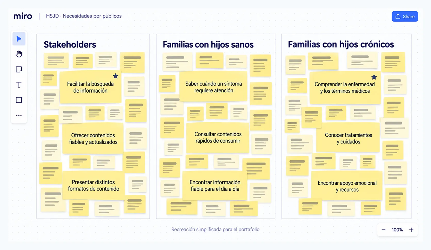
The needs and requirements gathered brought together the perspectives of stakeholders, families with healthy children, and families with chronically ill children. The platform had to address prevention, information about conditions, and everyday support.
The design goal was to define a structure that let people find their way, locate relevant information, and explore it at different levels of detail.
Find your way → find → understand → access resources
BENCHMARKING
The team had run the workshops before I joined. I reviewed the needs I received and compared them with a benchmark of health platforms.
The comparison helped me assess how leading examples handled access, reading, and the relationships between content. I used that analysis to choose patterns that answered the project’s needs and to spot problems worth avoiding.
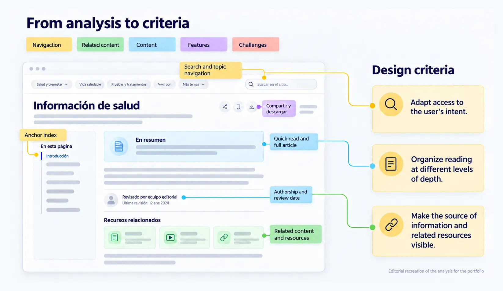
Three criteria came out of it:
Adapt access to what people are looking for.
Organize reading at different levels of depth.
Make the source of the information and related resources visible.
Earlier workshops → benchmark → design criteria → architecture → wireframes
NAVIGATION
A family looking for general advice doesn’t arrive with the same question as someone who needs to understand a diagnosis. The architecture had to account for those differences and connect the landing pages with the detail pages.
I defined a sitemap and a diagram that organized the areas of healthy living, conditions, family support, training, and news, along with search.
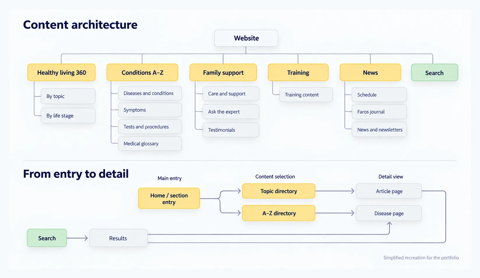
I also worked on the home page and the section landing pages to give each area context and bring its content closer. The architecture set the relationship between these layers: general entry, choosing content, and reading the details.
The first wireframes used broad blocks to review hierarchies and relationships before defining how they would look.
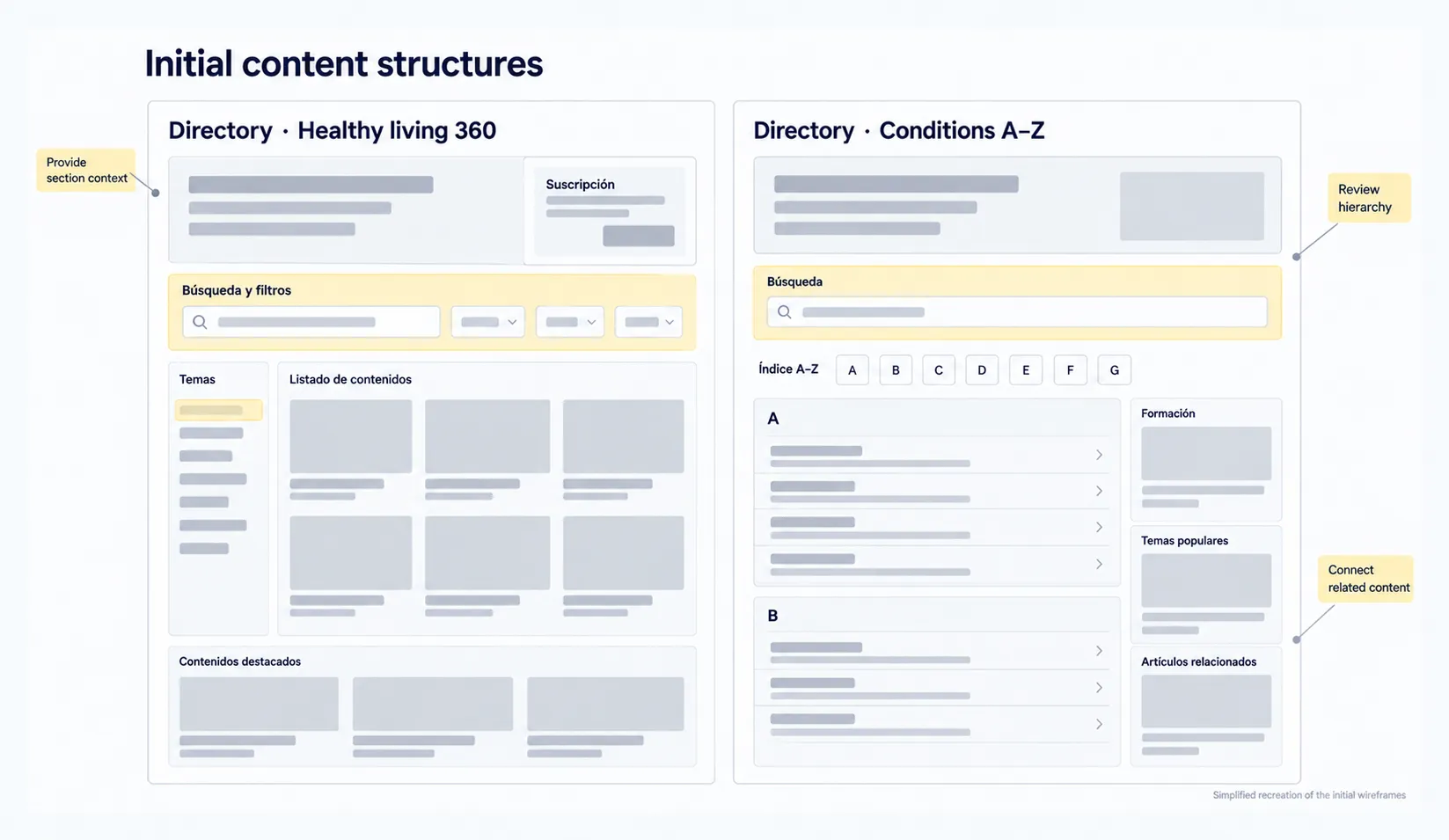
First define how the system connected, then adjust access and reading for each type of page.
DISCOVERY FLOW
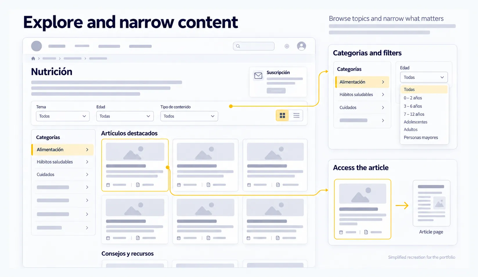
Families with healthy children needed access to advice and content about healthy habits. For that kind of exploration, I proposed hub pages with categories and filters to browse articles and narrow down what was relevant.
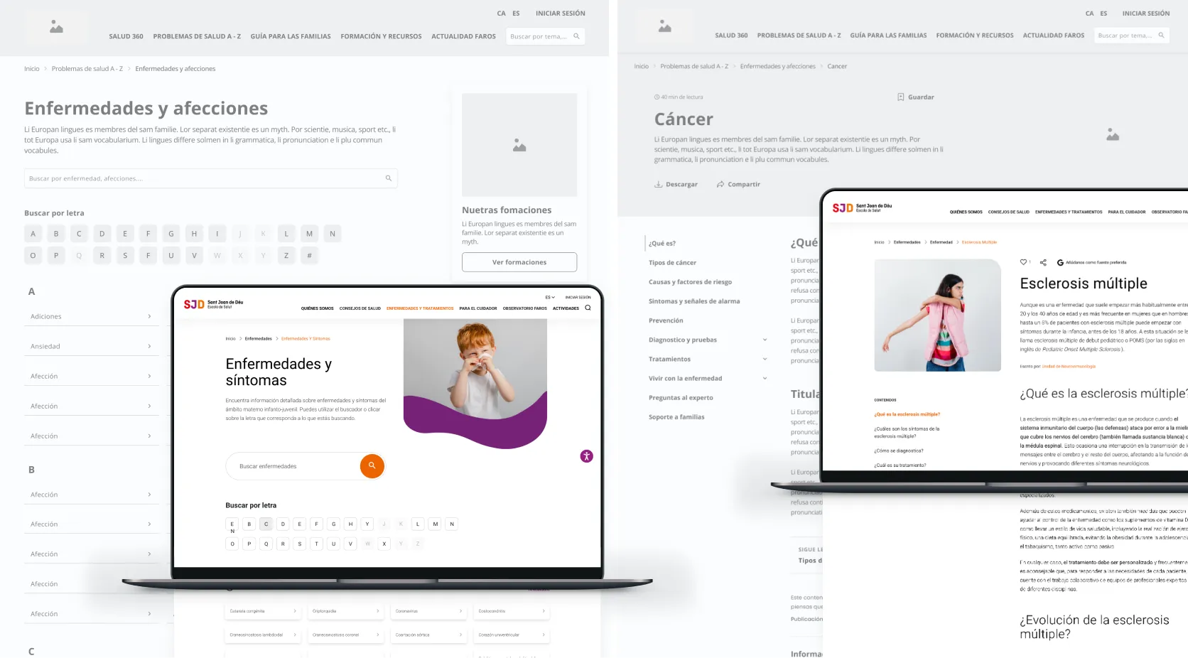
Families with chronically ill children needed to learn about a condition, its symptoms, or its treatments. For looking up a specific condition, I proposed search and alphabetical access to make it easy to find a known term.
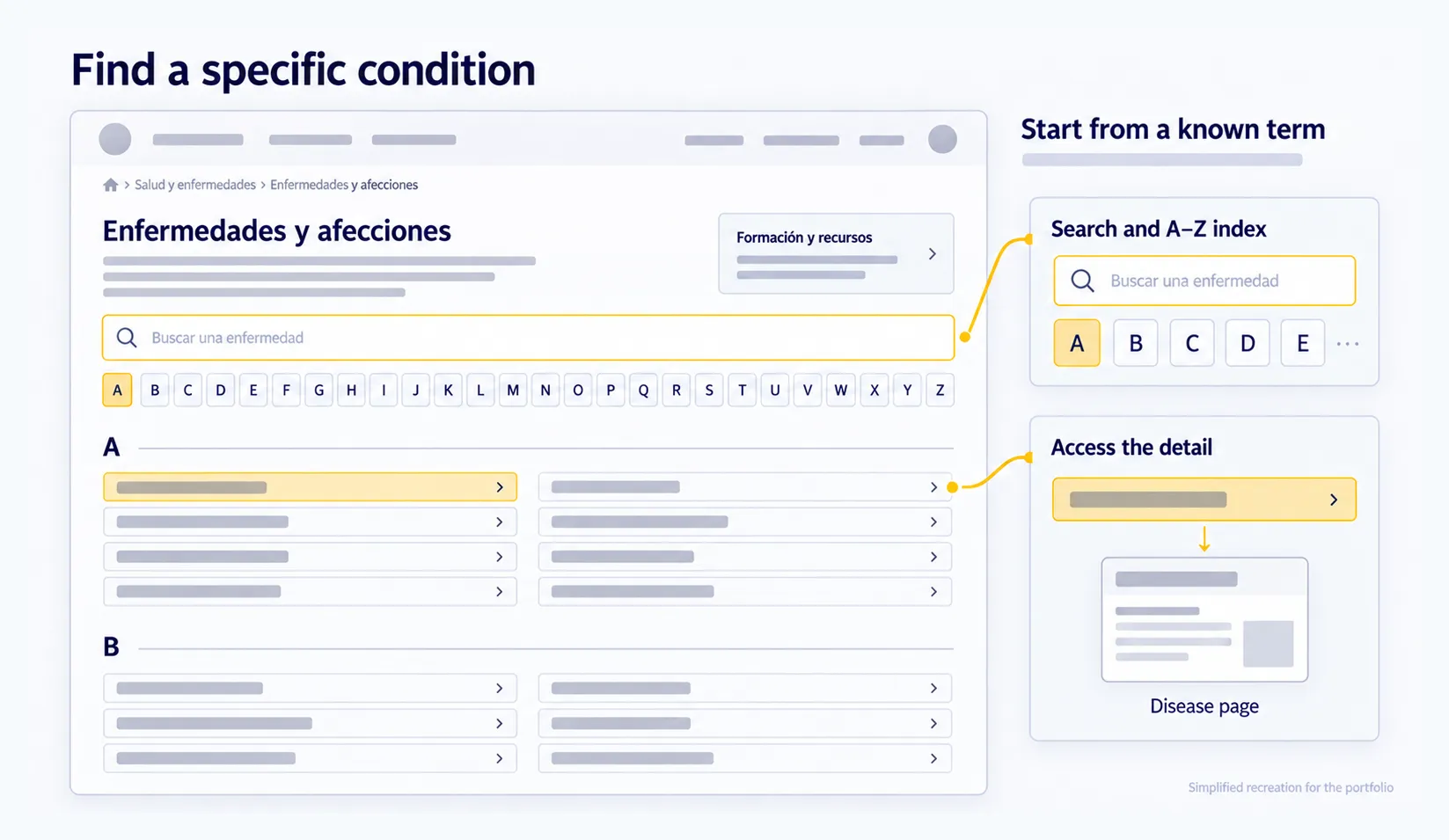
Exploring content and looking up specific information had to work side by side. I adapted the same hub page concept to both needs: different ways in, with one shared purpose, helping people reach the detailed content.
UX WIREFRAMES
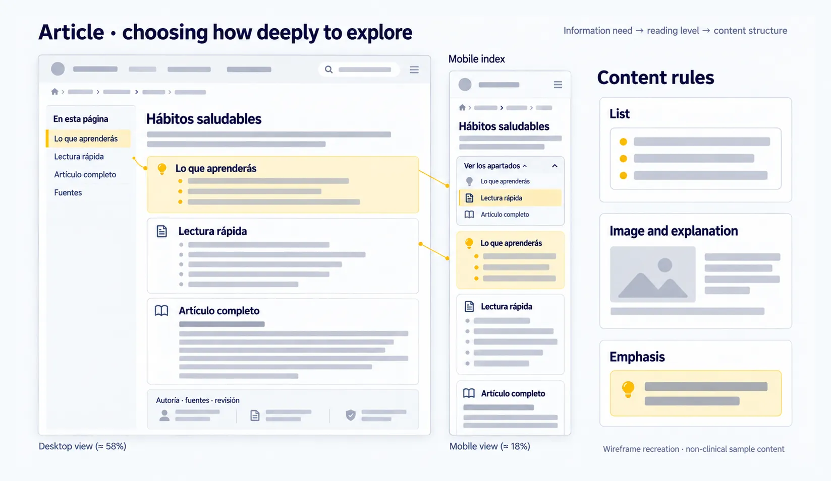
The needs we received showed that some families had little time and preferred quick formats. For articles, I proposed a summary of what you would learn, a quick read, and the full content: a structure that let people choose how deep to go.
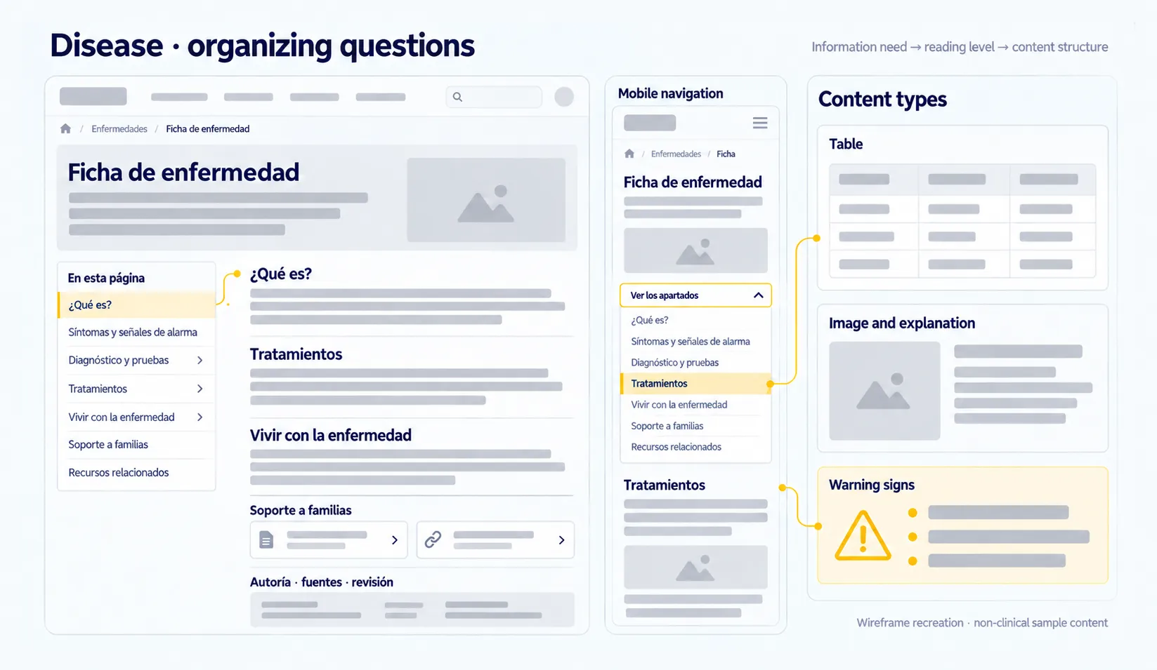
For families with chronically ill children, looking up a condition meant understanding it, learning about treatments, and finding support. I organized the condition pages into sections that followed those questions, from the first explanation to living with the condition and resources for families.
I defined indexes and side menus to reach each section, including their mobile version, and added authorship, sources, and review dates to make the origin of the content visible.
The work went down to the level of content blocks: lists, tables, images, and content that needed emphasis, like warning signs. These rules guided how to present information based on its nature.
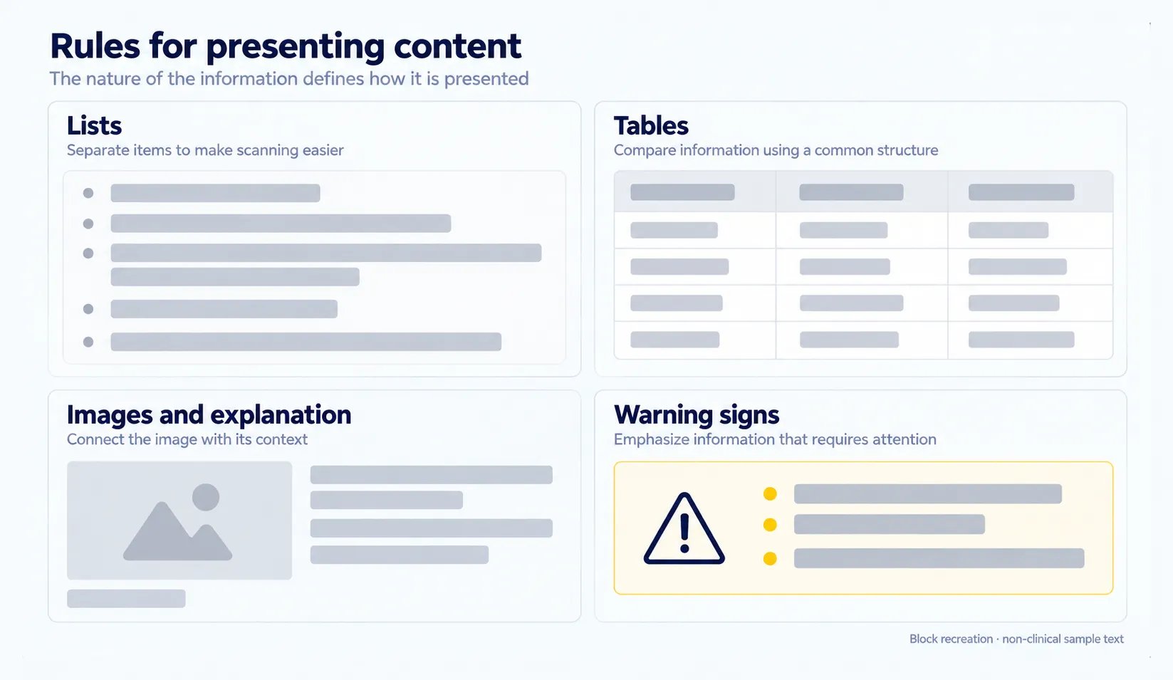
What people need to look up → reading level → content structure
PRIORITIZATION
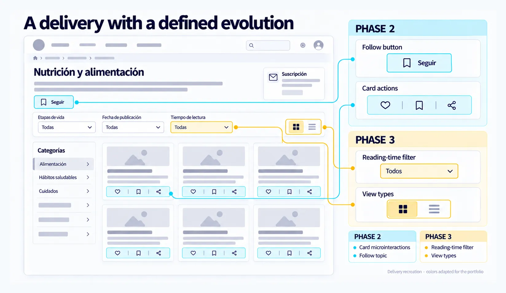
Once the proposal was defined, concerns came up about implementing some features, along with pressure to move forward. The team asked me to prioritize.
I reviewed what each feature contributed to the needs we had identified and organized the proposal into phases. I showed that sequence directly on the wireframes, with marks that set apart the elements planned for later.
The delivery gave the team a reference to move forward step by step while keeping the proposed evolution visible.
UX REVIEW
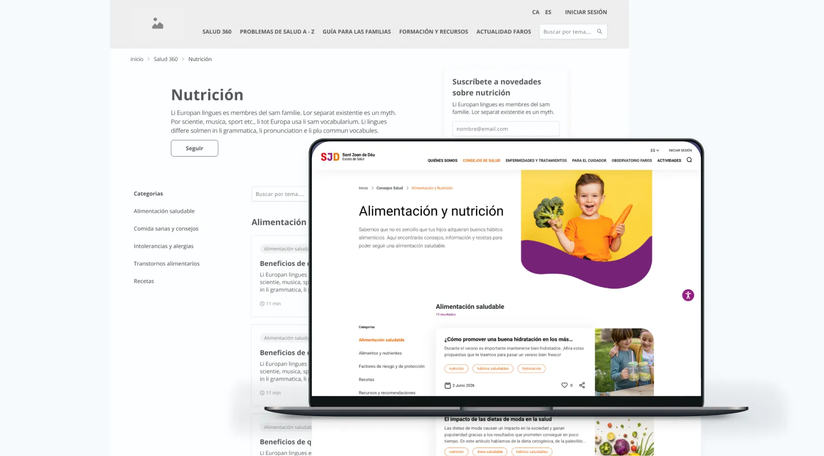
I reviewed the architecture and wireframes with the team and my manager. Then the UI team developed the visual design, which we reviewed together to keep the experience consistent.
My knowledge of UI components helped me define structures and behaviors from the wireframe stage. At Fail Fast, I often got feedback on how clear my wireframes were and how easy they were to carry into the visual design. That level of detail gave the team a base to keep working from: hierarchies, content patterns, and interactions already defined.
Attribution note: the research done before I joined was the team’s work, and the final visual design was the UI team’s. My work focused on information architecture, wireframes, and phased prioritization.
RESULT
The delivery brought together a connected architecture, page patterns for desktop and mobile, and a phased implementation sequence.
On the platform, as checked recently, structures from the proposal are still recognizable:
These patterns show structural continuity with today’s product, which has kept evolving since I worked on it.
LEARNINGS
Families with healthy children and families with chronically ill children asked different questions. Exploring and looking up specific information had to work side by side to answer them.
Working on indexes, reading levels, and block types helped define the experience before the visual design.
Prioritizing let me connect the experience proposal with an implementation sequence, defining what had to move forward and what was planned for later.
Anticipating components and behaviors helped me explain how the structure should work and made it easier for the UI team to take it forward.