'%3e%3cmask%20id='mask0_15927_6579'%20style='mask-type:luminance'%20maskUnits='userSpaceOnUse'%20x='0'%20y='0'%20width='20'%20height='20'%3e%3cpath%20d='M0%200H20V20H0V0Z'%20fill='white'/%3e%3c/mask%3e%3cg%20mask='url(%23mask0_15927_6579)'%3e%3cpath%20fill-rule='evenodd'%20clip-rule='evenodd'%20d='M10%200C4.475%200%200%204.475%200%2010C0%2014.425%202.8625%2018.1625%206.8375%2019.4875C7.3375%2019.575%207.525%2019.275%207.525%2019.0125C7.525%2018.775%207.5125%2017.9875%207.5125%2017.15C5%2017.6125%204.35%2016.5375%204.15%2015.975C4.0375%2015.6875%203.55%2014.8%203.125%2014.5625C2.775%2014.375%202.275%2013.9125%203.1125%2013.9C3.9%2013.8875%204.4625%2014.625%204.65%2014.925C5.55%2016.4375%206.9875%2016.0125%207.5625%2015.75C7.65%2015.1%207.9125%2014.6625%208.2%2014.4125C5.975%2014.1625%203.65%2013.3%203.65%209.475C3.65%208.3875%204.0375%207.4875%204.675%206.7875C4.575%206.5375%204.225%205.5125%204.775%204.1375C4.775%204.1375%205.6125%203.875%207.525%205.1625C8.325%204.9375%209.175%204.825%2010.025%204.825C10.875%204.825%2011.725%204.9375%2012.525%205.1625C14.4375%203.8625%2015.275%204.1375%2015.275%204.1375C15.825%205.5125%2015.475%206.5375%2015.375%206.7875C16.0125%207.4875%2016.4%208.375%2016.4%209.475C16.4%2013.3125%2014.0625%2014.1625%2011.8375%2014.4125C12.2%2014.725%2012.5125%2015.325%2012.5125%2016.2625C12.5125%2017.6%2012.5%2018.675%2012.5%2019.0125C12.5%2019.275%2012.6875%2019.5875%2013.1875%2019.4875C15.1726%2018.8173%2016.8976%2017.5414%2018.1197%2015.8395C19.3418%2014.1375%2019.9994%2012.0952%2020%2010C20%204.475%2015.525%200%2010%200Z'%20fill='white'/%3e%3c/g%3e%3c/g%3e%3cdefs%3e%3cclipPath%20id='clip0_15927_6579'%3e%3crect%20width='20'%20height='20'%20fill='white'/%3e%3c/clipPath%3e%3c/defs%3e%3c/svg%3e) GitHub
GitHub'%3e%3cpath%20id='Vector'%20fill-rule='evenodd'%20clip-rule='evenodd'%20d='M0.833333%202.365C0.833774%201.95891%200.995288%201.56958%201.28244%201.28244C1.56958%200.995288%201.95891%200.833774%202.365%200.833333H17.6333C17.8346%200.833005%2018.034%200.872386%2018.2201%200.949222C18.4062%201.02606%2018.5753%201.13884%2018.7177%201.28111C18.8601%201.42339%2018.9731%201.59235%2019.0501%201.77834C19.1272%201.96433%2019.1668%202.16369%2019.1667%202.365V17.6333C19.1667%2018.0399%2019.0052%2018.4297%2018.7179%2018.7173C18.4305%2019.0048%2018.0407%2019.1664%2017.6342%2019.1667H2.365C1.95877%2019.1662%201.56931%2019.0046%201.28214%2018.7173C0.99497%2018.4299%200.833554%2018.0404%200.833333%2017.6342V2.365ZM8.09%207.82333H10.5725V9.07C10.9308%208.35333%2011.8475%207.70833%2013.225%207.70833C15.8658%207.70833%2016.4917%209.13583%2016.4917%2011.755V16.6067H13.8192V12.3517C13.8192%2010.86%2013.4608%2010.0183%2012.5508%2010.0183C11.2883%2010.0183%2010.7633%2010.9258%2010.7633%2012.3517V16.6067H8.09V7.82333ZM3.50667%2016.4925H6.18V7.70833H3.50667V16.4925ZM6.5625%204.84333C6.56754%205.07223%206.52681%205.29982%206.4427%205.51276C6.35859%205.7257%206.23279%205.9197%206.07269%206.08336C5.91259%206.24702%205.72142%206.37706%205.51038%206.46584C5.29934%206.55462%205.0727%206.60035%204.84375%206.60035C4.6148%206.60035%204.38816%206.55462%204.17712%206.46584C3.96608%206.37706%203.77491%206.24702%203.61481%206.08336C3.45471%205.9197%203.32891%205.7257%203.2448%205.51276C3.16069%205.29982%203.11996%205.07223%203.125%204.84333C3.13489%204.39405%203.32032%203.96649%203.64157%203.65224C3.96282%203.33798%204.39435%203.16201%204.84375%203.16201C5.29315%203.16201%205.72468%203.33798%206.04593%203.65224C6.36718%203.96649%206.55261%204.39405%206.5625%204.84333Z'%20fill='white'/%3e%3c/g%3e%3cdefs%3e%3cclipPath%20id='clip0_0_641'%3e%3crect%20width='20'%20height='20'%20fill='white'/%3e%3c/clipPath%3e%3c/defs%3e%3c/svg%3e) LinkedIn
LinkedInChallenge
When users entered a brand like Adidas, they landed straight on a product grid.
Paula RodasSenior Product Designer & Product Builder· open to new projects
Work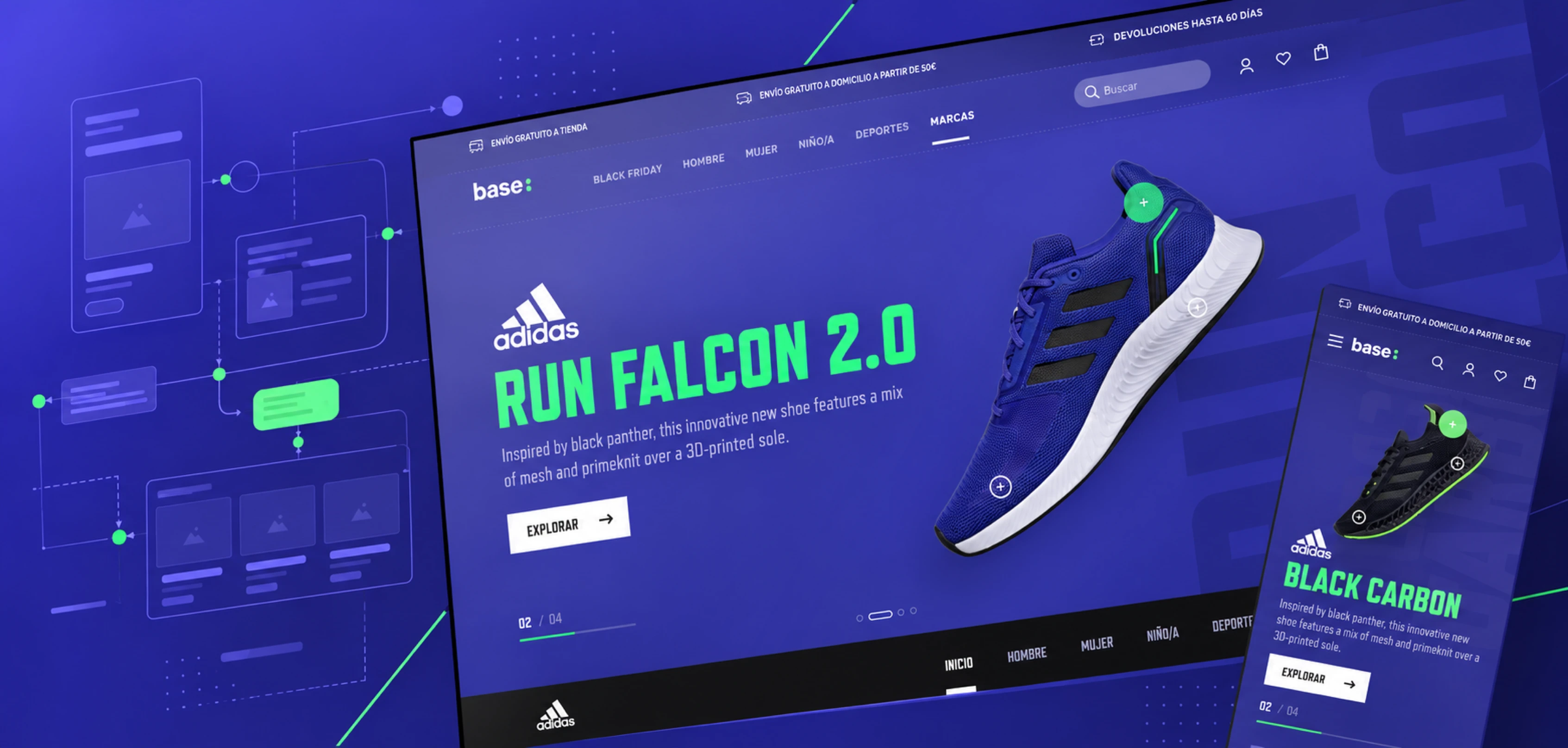
How do you turn a direct entry into a product grid into a brand experience that helps people explore the catalog? From benchmarking to a reusable content architecture: a new brand landing page and its related journeys for Base's ecommerce site.
8 min read
When users entered a brand like Adidas, they landed straight on a product grid.
Starting from a benchmark, I defined the content architecture, validated it with the client, and designed the wireframes.
Separate structure from content. The logic had to hold even when the brand, the products, or the campaigns changed.
The brand experience was implemented, and its entry point no longer relied only on a generic grid.

OVERVIEW
During my time at Fail Fast, I worked on the UX definition of a new brand experience for Base. The initial brief was to replace the direct entry into a product grid with a landing page that organized how people explored the catalog. Starting from a benchmark, I defined the content architecture, validated it with the client, and designed the wireframes. The scope then grew to include the related pages and a proposal for product cards and quick view. After the UI team’s visual work, I prepared the final prototype of the brand experience.
THE CHALLENGE
When users entered a brand like Adidas, they landed straight on a product grid. They could reach the catalog, but there was no landing page to introduce the brand and offer different ways to explore its range.
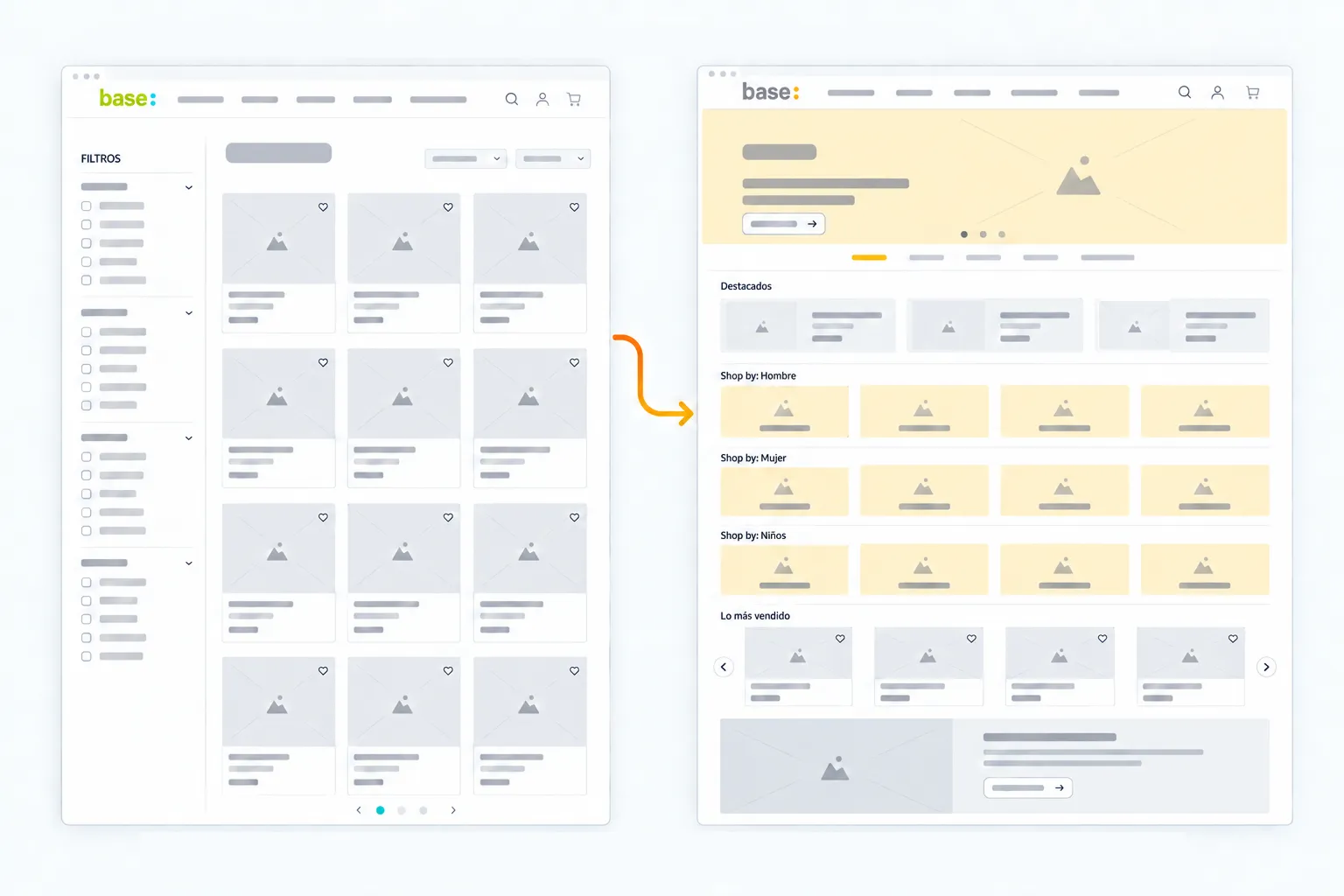
The brief couldn’t be solved just for Adidas: the logic had to work later for other brands, with different catalogs and content.
The main challenges were:
The goal was to make it easier to move from the brand context to exploring relevant products.
Recognize the brand → choose a path → explore the range → find products.
BENCHMARKING
I analyzed multi-brand ecommerce and sports retail sites that already offered this kind of landing page. I broke their pages down into sections and used color coding to compare what each piece of content did, how much space it took, and how it appeared on mobile and desktop.
The classification separated brand identity, local navigation and search, general or gender-based entry points, featured content, product recommendations, promotional content, and sign-up.
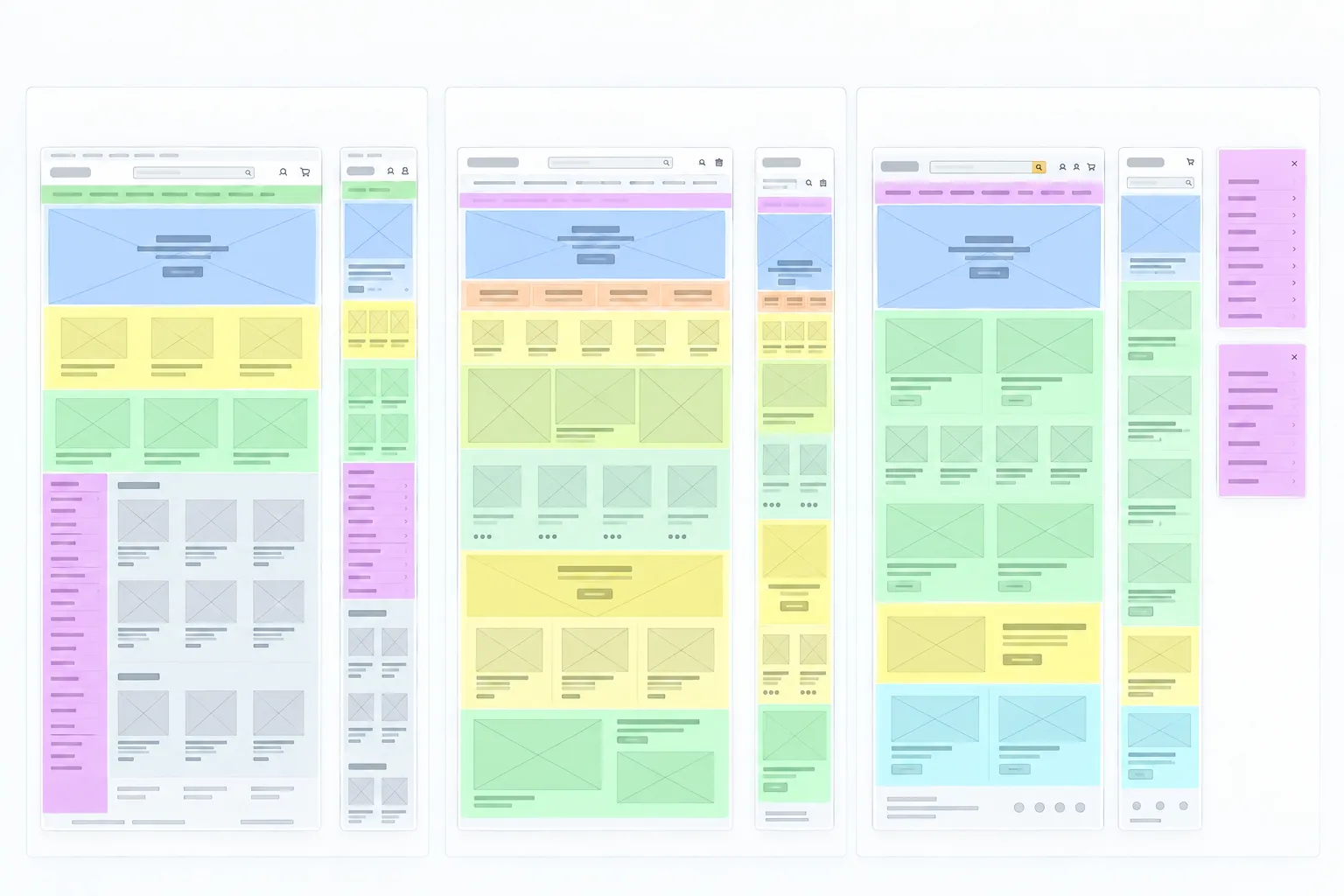
Criteria drawn from the analysis:
Separate orientation from exploration. Breadcrumbs show where users are; the menu inside the brand offers paths to keep going.
Offer several ways into the catalog. Gender, sport, and category let people start exploring from different points.
Combine modules with different jobs. Featured items, category shortcuts, and product listings don’t play the same role.
Separate structure from content. The logic had to hold even when the brand, the products, or the campaigns changed.
References → section classification → criteria → content architecture → wireframes.
INFORMATION ARCHITECTURE
After the benchmark, I created a diagram that connected navigation, content types, and presentation options. The proposal separated required elements, like brand identity, from options that could vary, like a banner, video, carousel, or grid.
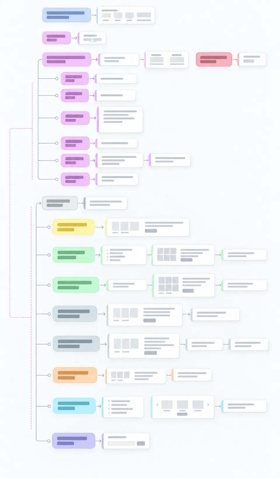
Local navigation included Home, Men, Women, Kids, Sports, and Deals. Each destination changed the context of the content: a general brand view shouldn’t show the same thing as a gender section or a specific sport.
The diagram also set out rules for applying it:
At this stage, I didn’t have exact sales or search metrics. So the diagram didn’t fix a hierarchy as if it were already backed by that data: it proposed that the choice and weight of the content should follow what sold or was searched for most in each context.
We validated this architecture with the client before moving to wireframes. The diagram also included UI pattern suggestions from the benchmark, so the UI and development teams could see how to apply the logic.
UX WIREFRAMES
With the architecture clearer, I designed the wireframes for the landing page and the related screens: “see all” views by gender, general sports grids, pages for a specific sport, deals, and search results.
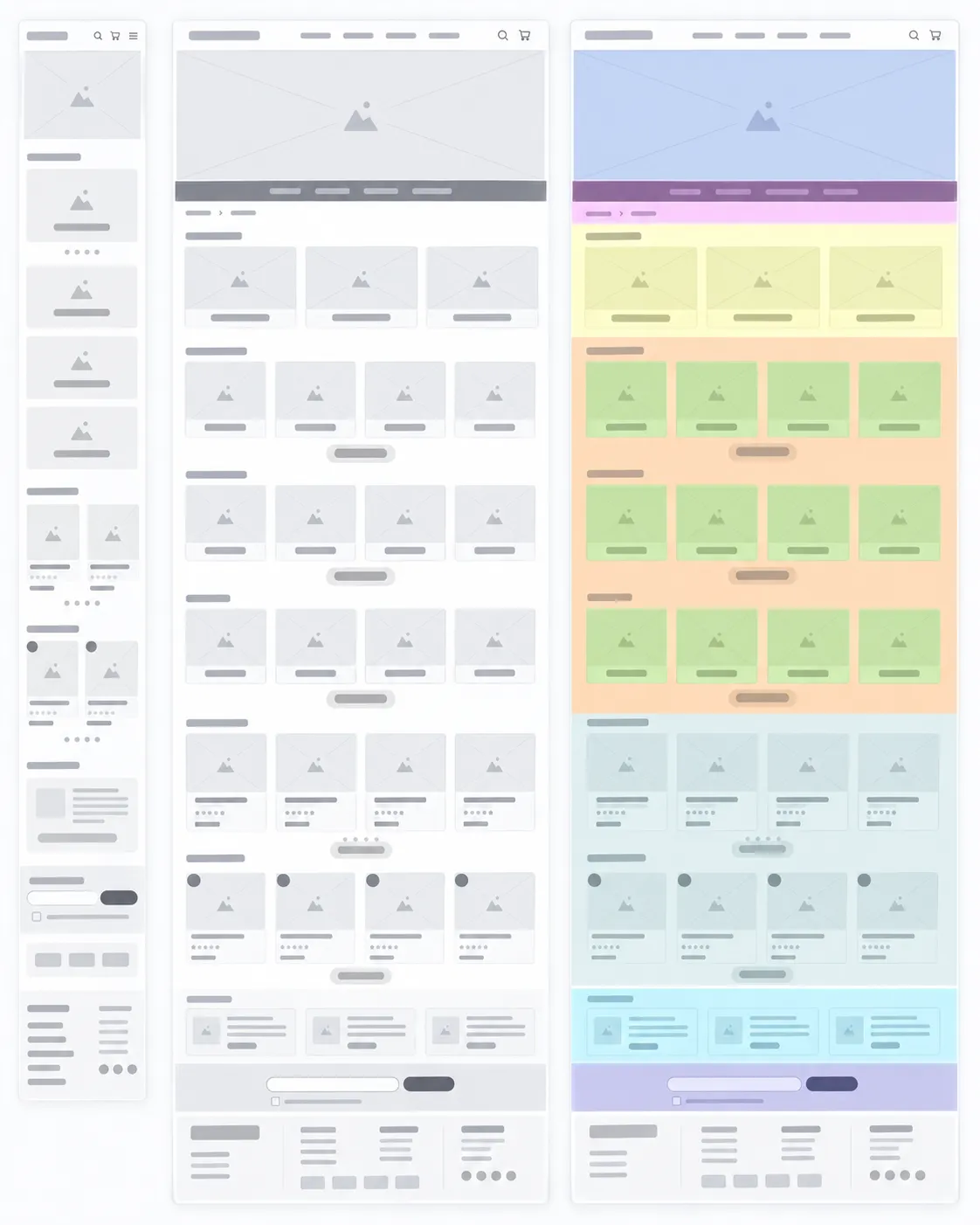
The wireframes defined the order and relationships between modules: from brand identity and catalog shortcuts to featured items, best sellers, deals, and supporting content.
The work included mobile and desktop versions. The diagram itself already suggested tabs for desktop and a collapsed menu for mobile: different presentations that kept access to the same paths.
The point wasn’t to design isolated screens, but to keep a clear relationship between the brand entry point and the levels of catalog exploration.
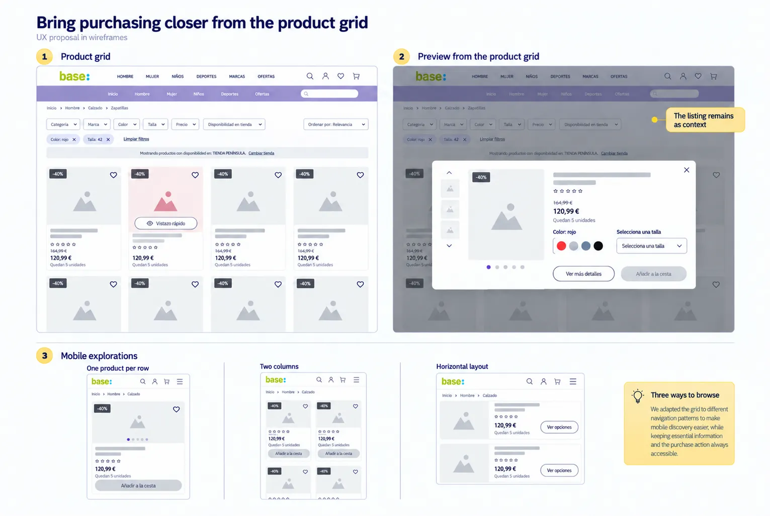
I also defined a UX proposal for the product grid and cards. The wireframes included applied filters, sorting, and checking in-store availability, along with commercial information visible from the listing.
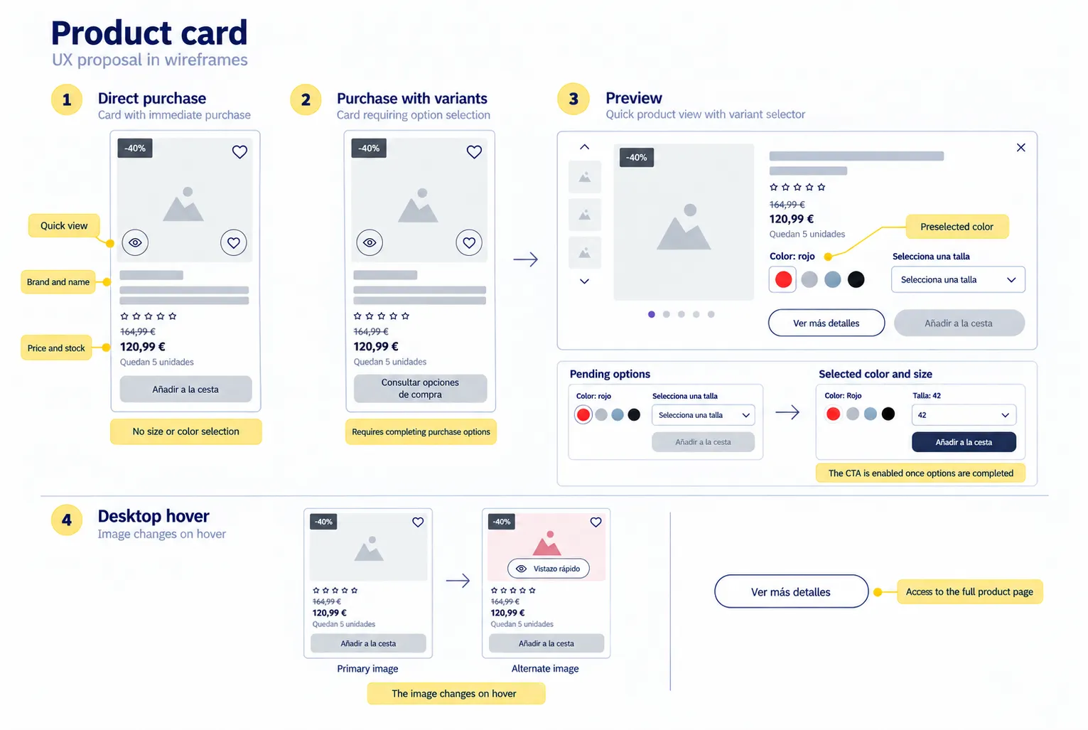
The cards brought together commercial information, stock, and quick-view actions to evaluate the product from the listing. On desktop, I proposed showing an alternative image on hover.
I defined two purchase paths depending on the options each product needed:
That way, the card’s action adapted to what the product needed, instead of offering the same direct purchase across the whole catalog.
The quick view brought together images, summary information, and color and size selection. The proposal included a preselected color and enabled “Add to cart” once the required options were chosen. “See more details” kept access to the full product page. Because it opened over the grid, it kept the listing as the context for exploring.
I also explored different mobile layouts: one product per row, two columns, and a horizontal layout.
PROTOTYPE
The wireframes went to the UI team, which defined the visual language and the high-fidelity screens. Then I took those screens to prepare the final prototype, connect the journeys, and make it easier to review with the client.
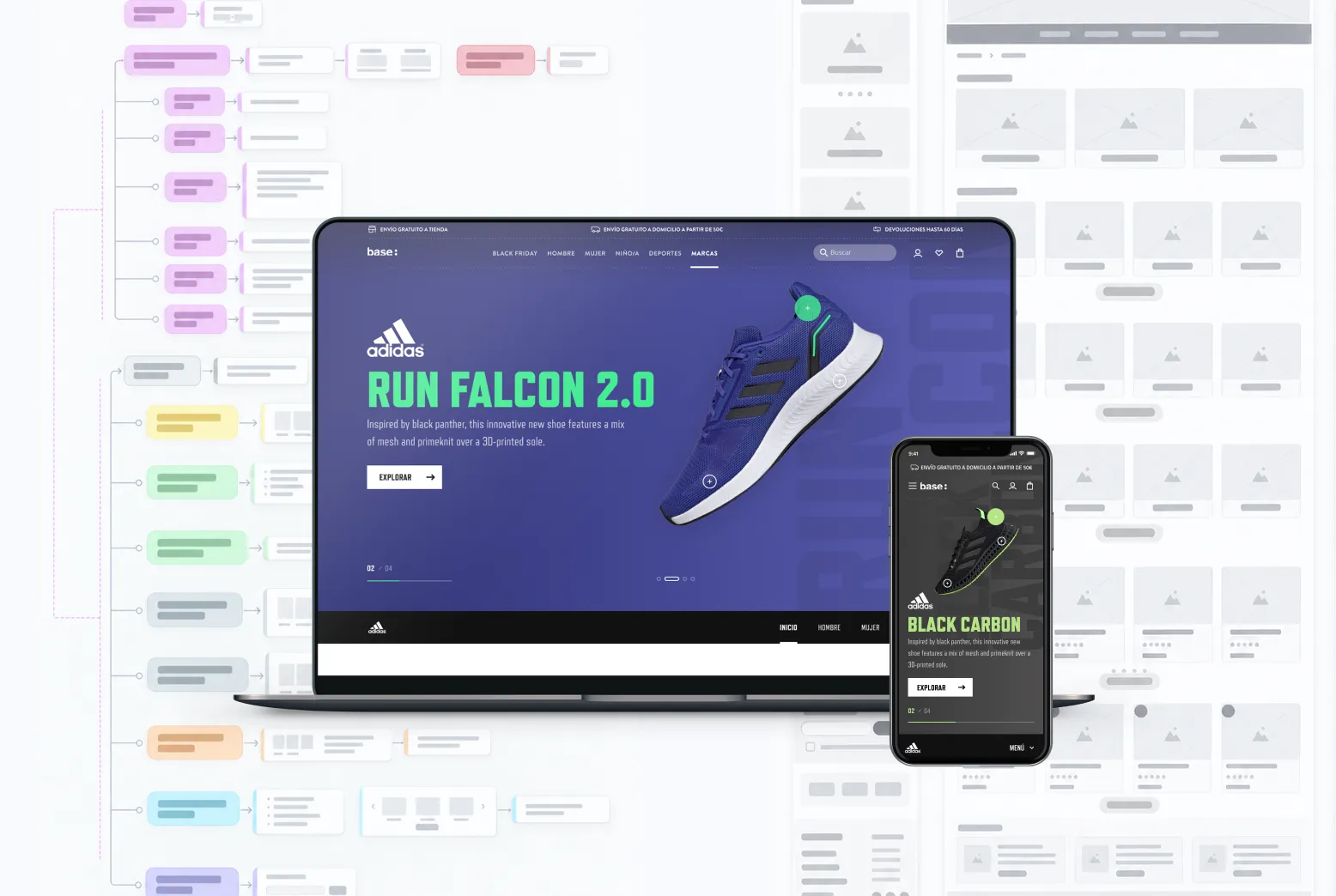
The prototype let us review the brand experience as a connected journey and served as the reference for development, with a light handoff.
My work focused on the UX definition and the prototype of the brand experience. The UI team defined its visual style, and the development team implemented it.
RESULT
The brand experience was implemented, and its entry point no longer relied only on a generic grid. The landing page added brand context, exploration paths, and modules connected to the catalog.
The current Adidas page on Base (opens in a new tab) shows the experience live, although its content and campaigns have changed since the project.
Context of the overall project: Fail Fast reports that the redesign exceeded its first-year sales targets (opens in a new tab). This is a shared result of the whole project, not something that can be attributed to this work alone.
LEARNINGS
Classifying sections let me go from collecting references to proposing a structure I could apply.
The same logic can adapt to different brands without forcing them to show the same modules or products.
Validating the diagram with the client helped define the wireframes and gave UI and development a shared path forward.
Next case study
UOC · From a complex catalog to a decision experience